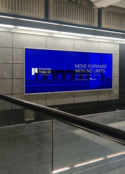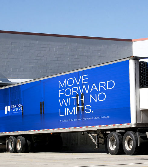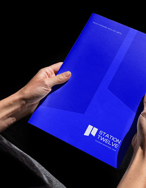
Station Twelve is a masterfully planned industrial hub, rebranded to reflect momentum, precision, and architectural strength. Positioned as a modern gateway for logistics, warehousing, and innovation, the brand signals both capability and ambition.
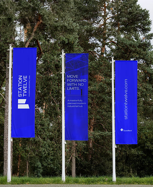
The logo for Station Twelve features a clean, modern sans-serif wordmark paired with a bold geometric symbol.
The symbol consists of two simplified building forms, with diagonally cut sides that introduce dynamic movement and visual interest. This architectural motif reinforces the brand’s focus on industrial innovation and forward-thinking design. The overall identity balances structure with energy, precise, purposeful, and built to scale.
A vibrant primary palette of electric blue sets the tone for clarity and confidence, contrasted with steel-inspired grays and cool sky blues. These colours evoke industrial materials, engineered efficiency, and a future-forward mindset.
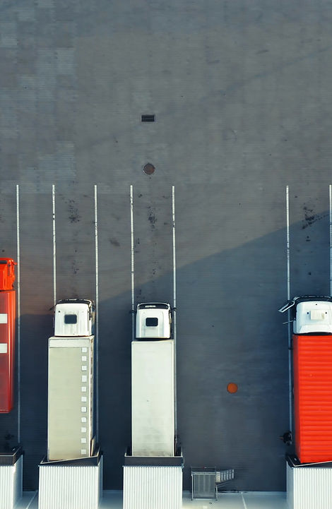
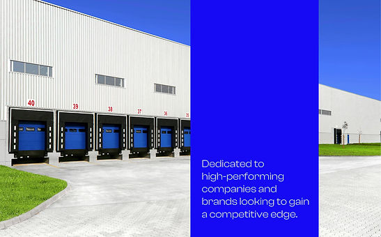
Graphic elements include clean lines, directional patterns, and architectural photography that reflect the form and function of industrial design. The tagline, “Move Forward With No Limits,” reinforces the brand’s position as a space built for growth, innovation, and possibility.


