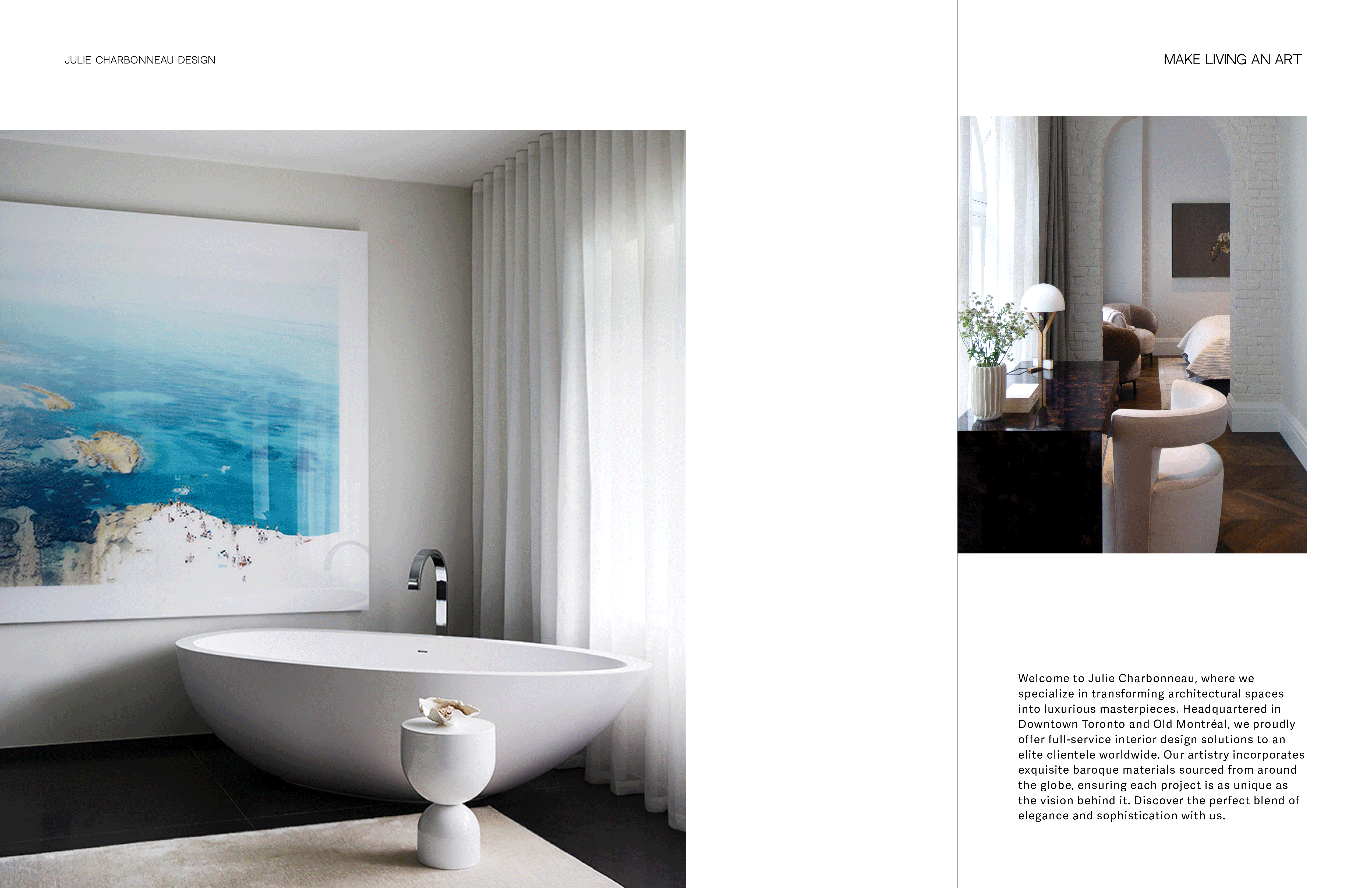
Julie Charbonneau Design specializes in luxury interiors defined by restraint, refinement, and a sense of quiet confidence. The rebrand reflects a studio philosophy grounded in elevated minimalism — where every detail, material, and gesture is considered with care.
The new identity system embraces a monochromatic palette of crisp white, deep black, and soft neutrals, creating a timeless visual language that speaks to elegance without excess. At its core is a custom logomark, JCD, rendered in a bold, architectural typeface. The vertical orientation and minimal styling of the mark echo both spatial awareness and editorial precision, allowing the brand to live confidently across print, digital, and spatial applications.
Typography is refined and restrained, using sharp sans-serif letterforms paired with ample white space to evoke clarity and calm. The brand’s tagline — "Make Living an Art" — anchors the voice of the studio, aligning the interiors practice with a deeper sense of intentional living and aesthetic discipline.
Every brand element is designed to feel poised and deliberate — understated yet impactful, sophisticated yet approachable — much like the spaces the studio creates.